Why hello there, everybody! I'm Kristi and I'm the newest addition to Michelle's team!
Yep, that's me! I'm going to be chiming in every now and again to give you guys the latest and the greatest in art, design, food, and all things fabulous and beautiful. Are you ready? Are you excited?! Me too! Let's jump right in.
For those of you who don’t know, Pantone is essentially the master of all things color and color-related. They even regard themselves as, “the world-renowned authority on color.” This is typically the point where I would poke fun at their egotism and immodesty. But I can’t, because it’s actually completely true. They really are the world-renowned authority on color. And I’d love to see someone try to debate otherwise. Go ahead. Try. I’ll wait.
Every year, Pantone releases it’s “Color of the Year,” what
it believes will be the most influential color that year in design, art,
children’s crayon drawings, whatever! I always wonder if the colors that they
choose become so popular because they chose them, or if it’s because they were
going to be popular anyway, and Pantone just always seems to pick up on it
before anyone else. Guess that depends on how much “authority” you think they
actually have. Maybe you don’t really like turquoise, maybe it’s just because
Pantone decided you were going to like turquoise (when it chose PANTONE 15-5519
Turquoise as 2010’s “Color of the Year”). Think about that for a minute!
Anywho, since Pantone has already decided what color I’m
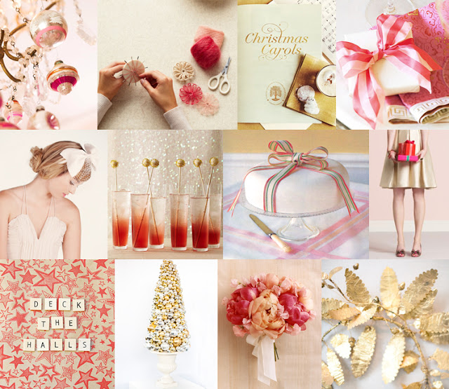
going to like best in 2012, I figured I’d put together a little mood board for
2011’s “Color of the Year” while it’s on its way out. Goodbye, PANTONE
18-2120 Honeysuckle. You were a delight.
And hello, Pantone 17-1463
Tangerine Tango. Pantone describes you as being, “sophisticated but at the
same time dramatic and seductive.” Ooh-la-la!
Bad news: Snooki’s skin tone may actually
be the true inspiration for Pantone’s choice of color for 2012. Yikes!
-Kristi